1. If it looks like a kindergartener could make it, how can we call it art?
I think that abstraction can go beyond a blue circle and a yellow square. It is about using materials and techniques to create something. I used different values of blues and greens in my piece which gave it some depth. Abstract art has a lot to do with emotion. It is about feeling something and finding a way to put that feeling on a canvas. There are also other ways to make a piece more substantial such as exploring composition, design, colours, techniques, shading, movement, and shapes.
2. How do artists find the essence of an object to abstract reality?
Artists find the essence of an object through looking at it in different environments and exploring shapes and colours. The idea is distorting or altering a real object, and making it your own. We can make it abstract through exploring texture, shape, colours, and movement.
3. How can I understand properties of paint, color mixing and apply them to an abstract composition?
Paint and colour mixing is an essential element to abstract pieces. Abstraction is about emotions, movement, and fluidity. Colours can evoke different emotions from the viewer. For example, red often connotes anger, or perhaps blood. Blue often resembles sadness, white resembles peace or simplicity, and green often connotes life. The use of these colours creates an emotional connection with the viewer. Colour mixing is also important, since it isn't very thoughtful to use paint straight from the bottle; it is better to mix colours until you get a specific shade.
4. In my painting, I focused on the movement of the piece. It is composed of shapes that are round on the sides, and pointy at the top - kind of like a pinched oval, or a feather. Blue and green waves move through the piece and around these shapes. I used blue since it was a simple colour, and green because it was relaxing. I wanted my painting to resemble somewhat of an ocean, but I included the feather shapes to make it original. The blue, purple and green are repeated to create unity. I also mixed white with these colours and gradually made it lighter as you move towards the feather shapes. This helps create depth, as well as make the painting more interesting for the viewer.
Monday, 6 May 2013
Tuesday, 9 April 2013
Abstract Art
Abstraction In Art
Robert Delaunay

This picture is objective abstraction because it is based on a stain-glass window. You can see the objects outside of the window incorporated with the shapes. I like the dramatic colours of pink, yellow, blue and green repeated throughout the piece. I also like the strong gradient value in the shapes. The repition of the yellow and the pink help create unity in the piece. The lines are geometric and resemble the lines in a stained glass window. The bright and warm colour scheme contribute to a cheerful mood.
Pablo Picasso

This piece by Pablo Picasso is an example of abstraction with cubism. The strong geometric shapes are repeated throughout the piece, and seem to have a very jagged texture. The tonal colour scheme includes colours such as brown, black, white, and beige, creating an overall neutral mood. The lines are geometric, based solely on cubic shapes. There is a repition with the angles and colours which create unity in the piece.
Fernand Léger

This abstract piece uses geometrical objects and bright colours. There is a sense of texture with the layering of the shapes, but texture with the brushstrokes is not visible. The circular shapes are repeated throughout the piece, as well as the orange triangular shapes. Also, the colours have a certain rhythm to them, and occur more than one throughout the piece. The movement seems to start at the top circle work its way down. Ferninand Léger included geometric lines, rather than organic lines, which form straight mechanical shapes.I really like the colours used in this piece. I think that the variety of the colours and the shapes make it a busy, and intriguing painting. There is no specific colour scheme because almost every colour on the spectrum is used. I think that the colours purple and yellow are used the most, and these would be complimentary, since they are opposite on the color spectrum.
Valisly Kandinsky

I really liked the feeling of space in this painting. It makes me think of planets and stars, and the black circle represents some kind of black hole. Because of this, I think it is objective abstraction, based on planets in space. It is exclusively composed of circles against a black backdrop. The circles are different sizes and colours to create variety. The pinky colour is repeated throughout the painting, as well as the blue colour to create unity. I like the way the circles seem to be floating towards the black hole in the top right corner. I also like the white glow around the indigo circle; it gives the painting a sense of spirituality. The colour scheme also includes a variety of colours which makes the piece more interesting.
Don't particulary like:

This painting was my least favorite simply because it didn't have a lot of thought put into it. While the others had excellent composition, texture, and colour scheme, I thought this one was a bit boring. The colours don't go together at all, and the shapes are too simple. I really do not like that yellowy-mustard colour against the light pink and red. Its just not very aesthetically pleasing. It looks like a kindergartener drew it, to be honest. There is nothing interesting about it, that draws you in and makes you want to see more.
Robert Delaunay
This picture is objective abstraction because it is based on a stain-glass window. You can see the objects outside of the window incorporated with the shapes. I like the dramatic colours of pink, yellow, blue and green repeated throughout the piece. I also like the strong gradient value in the shapes. The repition of the yellow and the pink help create unity in the piece. The lines are geometric and resemble the lines in a stained glass window. The bright and warm colour scheme contribute to a cheerful mood.
Pablo Picasso
This piece by Pablo Picasso is an example of abstraction with cubism. The strong geometric shapes are repeated throughout the piece, and seem to have a very jagged texture. The tonal colour scheme includes colours such as brown, black, white, and beige, creating an overall neutral mood. The lines are geometric, based solely on cubic shapes. There is a repition with the angles and colours which create unity in the piece.
Fernand Léger
This abstract piece uses geometrical objects and bright colours. There is a sense of texture with the layering of the shapes, but texture with the brushstrokes is not visible. The circular shapes are repeated throughout the piece, as well as the orange triangular shapes. Also, the colours have a certain rhythm to them, and occur more than one throughout the piece. The movement seems to start at the top circle work its way down. Ferninand Léger included geometric lines, rather than organic lines, which form straight mechanical shapes.I really like the colours used in this piece. I think that the variety of the colours and the shapes make it a busy, and intriguing painting. There is no specific colour scheme because almost every colour on the spectrum is used. I think that the colours purple and yellow are used the most, and these would be complimentary, since they are opposite on the color spectrum.
Valisly Kandinsky

I really liked the feeling of space in this painting. It makes me think of planets and stars, and the black circle represents some kind of black hole. Because of this, I think it is objective abstraction, based on planets in space. It is exclusively composed of circles against a black backdrop. The circles are different sizes and colours to create variety. The pinky colour is repeated throughout the painting, as well as the blue colour to create unity. I like the way the circles seem to be floating towards the black hole in the top right corner. I also like the white glow around the indigo circle; it gives the painting a sense of spirituality. The colour scheme also includes a variety of colours which makes the piece more interesting.
Don't particulary like:
This painting was my least favorite simply because it didn't have a lot of thought put into it. While the others had excellent composition, texture, and colour scheme, I thought this one was a bit boring. The colours don't go together at all, and the shapes are too simple. I really do not like that yellowy-mustard colour against the light pink and red. Its just not very aesthetically pleasing. It looks like a kindergartener drew it, to be honest. There is nothing interesting about it, that draws you in and makes you want to see more.
Tuesday, 12 February 2013
Portrait Photography
 |
| This photo of Julia expresses her fun, energetic, and nature-loving personality. The setting of being in a tree, presents an extreme angle and therefore makes the photo interesting. The photographer is closer to the subject, and the viewer can see more details of her face. The rule of thirds is used, with the subject on the left side of picture. I chose to keep the photo in colour because her blue shirt matches the blue in her eyes, and I thought that brought the picture together more. |
 |
| This photo of my sister shows her caring, and gentle personality, as well as her love for animals. The photographer is closer to the subject, and her long eyelashes and warm embrace make her seem like a gentle person. The rule of third is used, as the cat's and the girl's eyes are on the top grid line. It is kept in colour to bring out her soft purple coat which provides a darker background for the cat. |
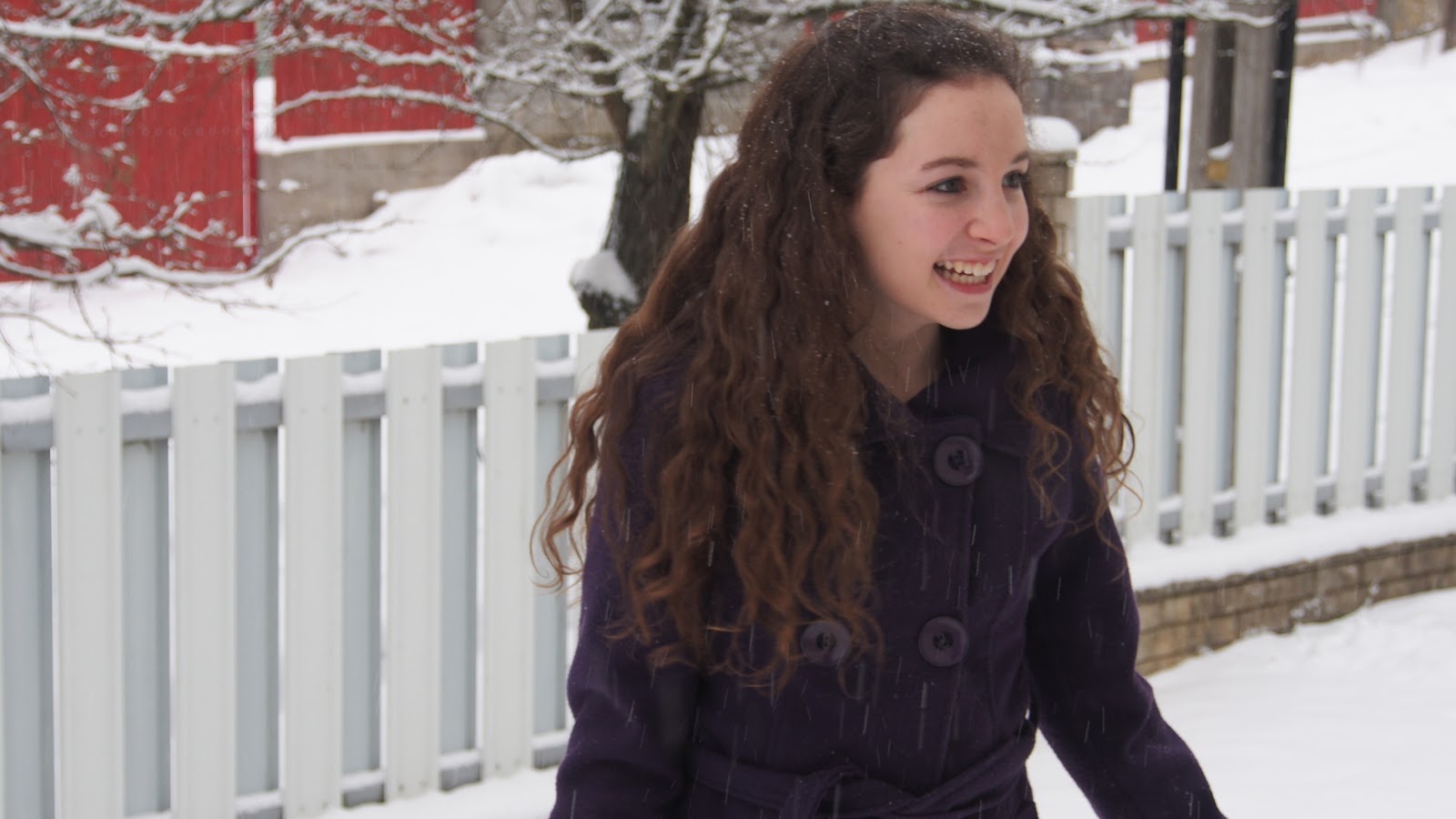 |
| This photo captures the subject in mid-laugh. My sister is not looking at the camera, but she is looking off into the distance and laughing, making the viewer wonder what she is looking at. Her bright eyes and wide smile show that she is a happy, energetic, cheerful person. The lines of the fence also follow the line of her sight, bringing leading lines into this picture. It also follows the rule of thirds, as she is on the left side of the picture, and high contrast, as there is a difference between the white background, and her dark purple coat. |
 |
| This photo of Julia shows her love for reading. The fact that the book is covering her face, indicates that her face could be replaced by a book, since she loves it so much. There is a high contrast with the white background, and the dark subject. Everything seems to be neutral colours such as brown, white, and grey, except for her bright blue shirt which really pops out. The person's face on the book is more or less aligned with her body, making it look like that it is her face. |
 |
| This photo captures the subject in mid-laugh, showing her fun, carefree personality. Her wide smile and bright eyes make it look like she's having fun. The viewer probably wonders what she is laughing at. There is a high contrast between the white background, and the dark subject. |
 |
This photo of Lera captures her in the midst of taking a picture. Her face is relaxed, perhaps concentrating on the photo. The viewer cannot see all of her face, the camera covers most of it. This perhaps expresses her love for photography. She is on the right side of the picture, following the rule of thirds. Her eyes, and the direction of the pointed camera, lead off the picture, making the viewer wonder what she is looking at. The lighting is really nice in this photo, and lights up her hair and parts of her face.
 |
| Add caption |
Wednesday, 30 January 2013
Cezanne Reflection
1. For this unit, I chose to make a painting of an orange sand-dune against a blue sky. I used oil paint, which allowed me to blend the colors on the canvas and work on it over a period of time without it drying out.
2. I used the contrasting colors of orange in blue to create my piece. There were many variations of these colours through the painting. The sand dune had different shades of orange, with red and yellow tints to create value. The sky followed a gradient pattern from dark blue to light blue with different shades of cobalt.
3. I applied Cezanne's techniques by using contrasting warm and cool colours. There were tints of blue in the sand dune to connect it with the blue of the sky, unifying the whole piece. At first, I had planned to use little droplets of thick paint and layer them on one by one, to create a texture. However, this technique took way to long, and didn't turn out the way I had planned. In the end, I smoothed it over, and went with a more simple texture.
4. The motif of my painting would be the orange color. This color appeared several times throughout the sand dune, and had different variations to create value.
5. I think that my painting creates a hot, desert-y mood. I established this through the use of bright, vibrant oranges and reds.
Tuesday, 29 January 2013
Portrait Visual Research

This artist reveals many things about herself in the photo. Her hand is covering her face, suggesting that she is a shy person. She chose to make the photo in black and white, keeping it simple and drawing our attention to the subject. The photo is composed so the person is in the bottom middle, of the page, and the words are creating a frame around her. The words are shaped in a thought bubble, and are above her head, to indicate that this is what she is thinking. The girl is hiding one of her eyes, suggesting her shy personality. The words surrounding her reveal her personality. She is telling the viewer that she contradicts herself, she is a dreamer, she likes to escape from things. She is easily hurt, and she is usually frightened. This is reemphasized by the picture of her. The viewers eye looks at the girl first, and then reads the words around her, going from left to right. The mood in this photo seems to be timid. She seems insecure in this photo, and the words around her support that. The viewer can come to the conclusion that the artist is a shy, insecure, but determined person.


This artist only shows the top half of her face in the photo. Her eyes are very vibrant, and seem to be happy, or perhaps curious. The white background helps bring our attention to the subject. The person is in the middle of the photo, and it is only a small part of the person's face, leaving the viewer to imagine what she looks like. The photographer is close to the subject, allowing us to see more details in the subject's face. The hat and the snow give it a winter-ish mood.

This photo is black and white, allowing us to focus on the forms and features of the girl. She seems to be looking off into the distance, and the viewer is wondering what she is looking at. The black background brings our attention to the subject. The lighting seems to be coming from in front of her face, which illuminates it. The sweeping hair around her face provides a frame for the subject. The mood of the photo is curiosity, because of her facial expression.
 The white, mystical colors in this photo contribute to a magical mood. The girl has a funny expression on her face, one that a lot of toddlers have. The color of her eyes seems to be repeated through her hair and her skin tone. The photographer is close to the subject. The background is made up of feathers and smoke, making the girl look almost like an angel. However, she doesn't have a peaceful, angelic face—she has a funny, frowning face. I suppose these ideas are juxtaposed in the photo.

This is a woman in Tibet. It seems to be taken in a poorer village, since her clothing and appearance seems to be poor as well. The yellow background is contrasted against the dark reds and the blue in her clothing. The photographer is close to her subject. Her rosy red cheeks are the same color of the red of her coat. The woman's eyes seem to be dejected, but maybe a bit hopeful. She seems to be shy to have her picture taken. There seems to be a dejected mood in this photo.

This photo was taken in South Africa. It is comprised of a young girl and a dog who are sitting outside. It is in black and white, highlighting the shapes of the subject, rather than the colours. The background is darker, focusing our attention on the girl's face. Everyone seems to be smiling in this photo, even the dog. The mood of the photo seems to be youth, with the young girl and the dog in front of the green plants.

This photo is black and white, allowing us to focus on the forms and features of the girl. She seems to be looking off into the distance, and the viewer is wondering what she is looking at. The black background brings our attention to the subject. The lighting seems to be coming from in front of her face, which illuminates it. The sweeping hair around her face provides a frame for the subject. The mood of the photo is curiosity, because of her facial expression.


This is a woman in Tibet. It seems to be taken in a poorer village, since her clothing and appearance seems to be poor as well. The yellow background is contrasted against the dark reds and the blue in her clothing. The photographer is close to her subject. Her rosy red cheeks are the same color of the red of her coat. The woman's eyes seem to be dejected, but maybe a bit hopeful. She seems to be shy to have her picture taken. There seems to be a dejected mood in this photo.

This photo was taken in South Africa. It is comprised of a young girl and a dog who are sitting outside. It is in black and white, highlighting the shapes of the subject, rather than the colours. The background is darker, focusing our attention on the girl's face. Everyone seems to be smiling in this photo, even the dog. The mood of the photo seems to be youth, with the young girl and the dog in front of the green plants.
Subscribe to:
Comments (Atom)